Reload animation hierarchy: where premium skins earn attention
Three readable beats can feel richer than a screen full of simultaneous effects.

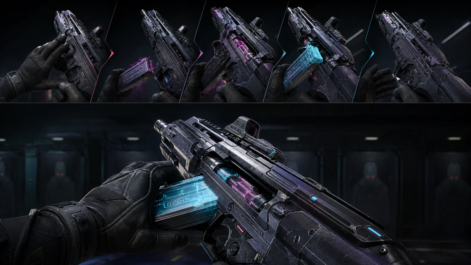
A reload animation is one of the few cosmetic sequences players see under real pressure. It must communicate weapon state immediately, preserve the timing players have learned and still deliver enough character to justify a premium presentation. Strong reload animation hierarchy solves those goals through ordered beats rather than constant movement.
Function must read first
The hand leaves the grip, the magazine or energy source is removed, a replacement is seated and the weapon returns to ready. A stylised sequence can bend these actions, but the player should always understand which stage is active. Effects that obscure the hand or duplicate the magazine create uncertainty even when the animation duration remains unchanged.
The primary movement should own the largest change in silhouette. Secondary parts can react with smaller rotations or light shifts. This prevents every mechanical panel from competing with the action that matters.
Give the accent one clear beat
Premium skins often use a creature response, energy pulse, sound cue or transformation. Place that accent at a meaningful transition: release, insertion or lock. When the accent runs continuously, it becomes a texture. When it answers one mechanical event, it becomes punctuation.
Sound should follow the same hierarchy. The functional click confirms state; the cosmetic layer supplies character around it. Our analysis of skin sound and weapon feel explains why clarity survives longer than novelty.
Protect peripheral readability
Players rarely study a reload in a clean preview. Their attention may be on the doorway while the weapon occupies peripheral vision. Test the animation at gameplay scale, under several map lighting conditions and without audio. If the main state change disappears, the design depends too heavily on presentation.
Colour can help, but it should mark state rather than flood the frame. A muted body with one moving accent often reads more reliably, as discussed in our muted-palette analysis.
Return to a stable silhouette
The final beat should settle quickly into the familiar aiming shape. Residual particles and moving ornaments can make the weapon feel unfinished even after it is mechanically ready. A short visual decay is expressive; a second competing animation taxes attention at the moment control returns.
A premium reload earns attention by directing it. Function establishes trust, one accent creates identity and the return confirms readiness. The sequence feels luxurious because every beat has space—not because every surface moves.
Editorial note
Original visual and interaction-design analysis; no purchase recommendation.
- VALORANT patch notes
- Kaizensclan Editorial Policy — editorial-policy.html
This article was reviewed on July 31, 2026.

Related stories
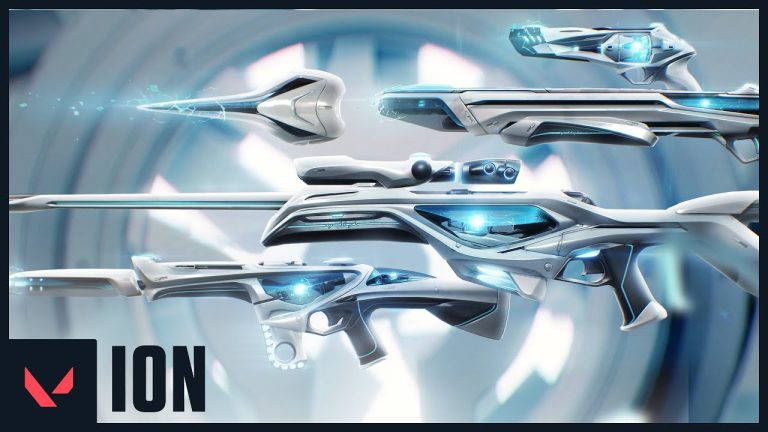
VALORANT Ion: clean science fiction built around energy
Riot revealed the original VALORANT Ion skin line in November 2020. Its white shells, dark joints and blue energy cores present a clean science-fiction weapon.
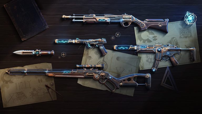
VALORANT Magepunk: electricity inside an old machine
VALORANT Magepunk first appeared in 2021 with Ghost, Spectre, Bucky, Marshal and Electroblade cosmetics, then expanded through later collections. The line.
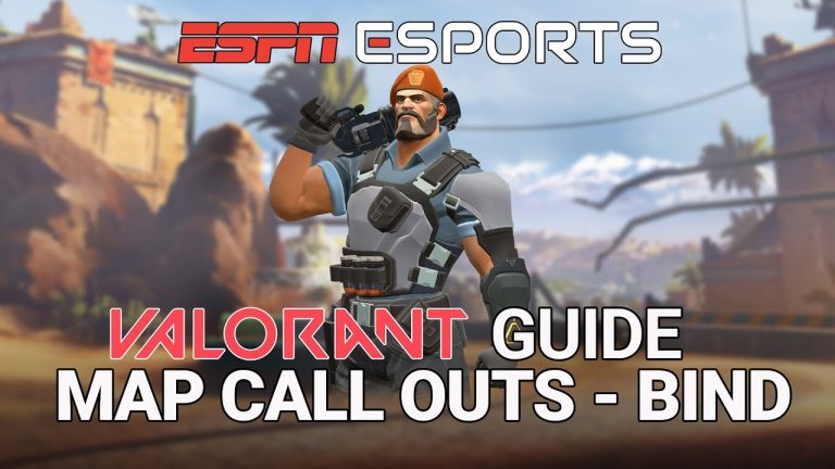
VALORANT Bind A execute guide for patch 13.02
A reliable Bind A execute creates two simultaneous problems instead of sending five players through A Short. Control either Showers or the Short cubbies, cut.
Community channel
Join the discussion
Start a thoughtful, specific conversation about this story.
Verified readers only
Continue with Google to comment.
Your Google account creates a reader-only Kaizensclan profile. Your first comment is reviewed before publication.